Why have I made these maps?
- Many media outlets are showing only portions of the data or speaking about it with out full context of what is happening.
- Example: Showing total numbers since March mean nothing about the current state of the virus spread
- Large red dots on a map do nothing to show trends and do not include any context around population (Johns Hopkins Maps)
- The spread of the virus needs to be analyzed in multiple ways to get a full picture of what is happening in the real world.
- Looking a the data in multiple different ways helps one gain better understanding of the spread and severity in certain areas.
- Since the CDC lowest level of granularity provided is at the county level, I’ve stuck with the county.
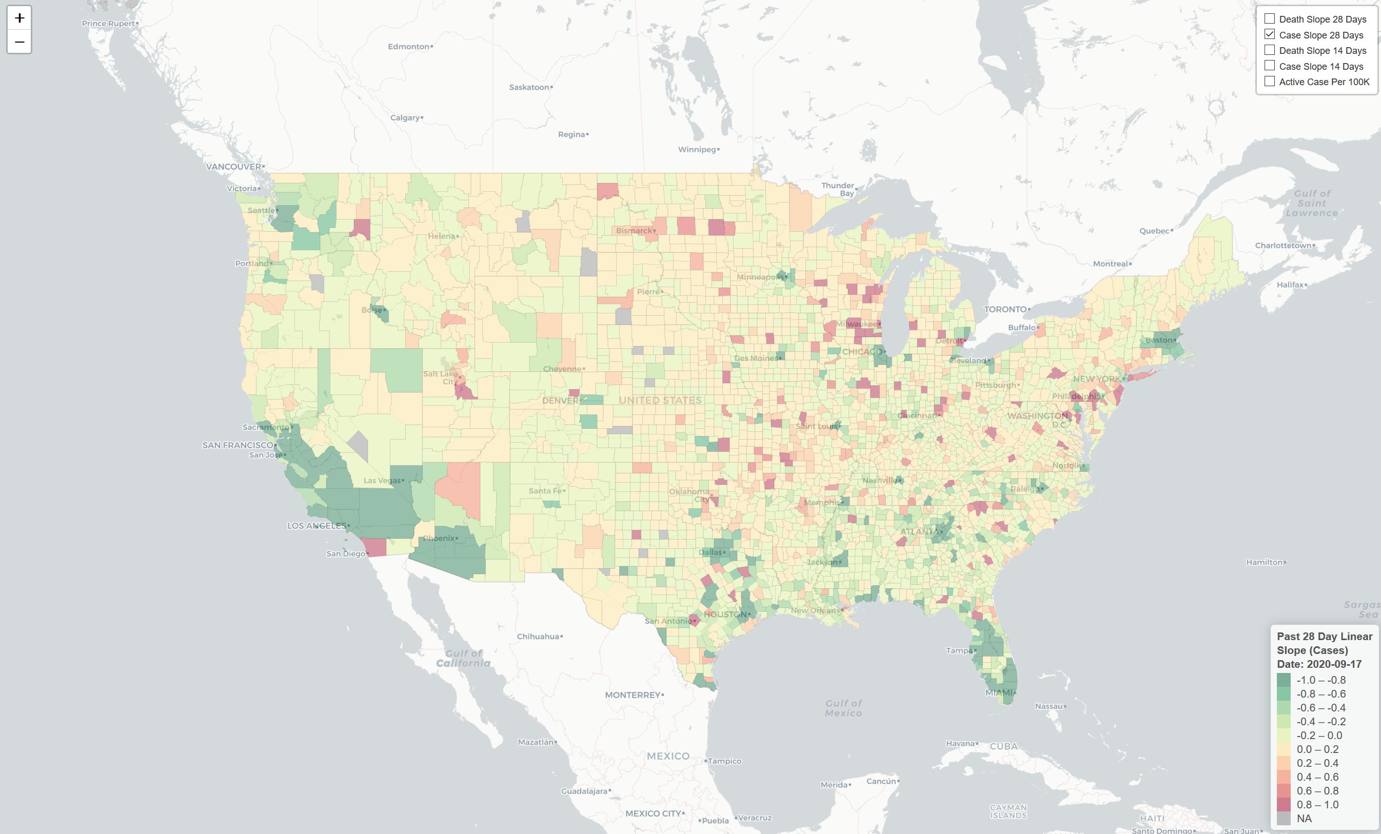
What are the maps?
5 Maps include (Selection Upper Right):
- 14 Day Linear Slope of new cases
- 28 Day Linear Slope of new cases
- 14 Day Linear Slope of new deaths
- 28 Day Linear Slope of new deaths
- Presumed Active cases per 100K residents
Further explanation:
- Linear Slope is meant to show the trend for the past 14 or 28 days.
- This is the slope of the best fit line between the points of each.
- The slope is built off 7 day
- The dots in each graph are rolling 7 day averages.
- Each dot includes the sum of the most recent day and the previous 6 divided by 7
- Presumed Active Cases Per 100K
- Sum of new cases in past 14 days / 2019 US Census Estimated population * 100,000